

Designing a Unified Visual System for Google Play Protect
My role: Interaction designer, UX designer (code implementation in Java for Android devices)
Company: Google
Product: Google Play Protect - Android 10
Platform: Android mobile, tablet and chromebook
Year: 2019

BACKGROUND
Google Play Protect needed a cohesive way to communicate its security alerts and notifications across different devices—from smartphones to Chromebooks. While there was an existing design system in place, my job was to implement it effectively, ensuring a unified experience across all surfaces. I served as the interaction designer, translating the design system into a functional and intuitive interface that clearly conveyed threat levels and provided a smooth user experience. Beyond design, I also took on the role of UX engineer, coding the solution into production for Android devices using Java.
OBJECTIVES
-
Implement a consistent visual language for security alerts that let users quickly understand the severity of an issue.
-
Create a responsive UI system that looked great on mobile, tablet, and Chromebook, using the existing design system as our foundation.
-
Deliver a seamless design-to-code implementation for Android devices, ensuring the user experience remained intact during the development phase.
THE PROBLEM
The original Play Protect UI was clunky and inconsistent, making it hard for users to differentiate between high-risk and low-risk alerts. The issue wasn’t just visual—it impacted how users trusted the notifications they were getting. In my role, I had to take the established design system and mold it into an interactive experience that worked smoothly across various device types. This involved making smart decisions about spacing, color usage, and interactivity to keep the design functional and visually aligned, while also diving deep into the code to ensure everything was built out correctly on Android devices.
MY RESPONSIBILITIES
Implementing the Existing Design System: I took the existing visual language and adapted it to fit the specific needs of Play Protect, translating static elements into dynamic components that worked seamlessly across different devices.
Designing Interactive Components: Created interactive alert cards and user flows that clearly communicated the severity of each threat, making it easy for users to distinguish between high and low-risk issues.
Ensuring Responsiveness: Built a modular layout that adapted effortlessly from small mobile screens to large Chromebook displays, maintaining visual balance and clarity across all orientations.
Coding the UI into Production: Developed the front-end UI in Java for Android devices, focusing on translating design details into high-quality code with smooth animations and interactions.
Accessibility Optimization: Implemented high-contrast colors, large touch targets, and responsive text sizing to ensure all components met accessibility standards.
Collaborating Across Teams: Worked closely with the design, engineering, and UX writing teams to align on visual consistency, technical feasibility, and content strategy.
Testing and Iteration: Conducted usability testing on multiple device types, using feedback to refine designs and improve the overall user experience.
Documentation & Handoff: Created detailed documentation to guide developers in implementing the design system consistently across all platforms, ensuring smooth and efficient handoff.
ICONS
OLD VS. NEW ICONS

NEW ICONS IN CARDS FOR GOOGLE PLAY PROTECT HOME

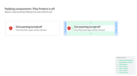
SPACING
PADDING PER DEVICES


MOBILE LANDSCAPE

TABLET PORTRAIT


CHROMEBOOK


CARDS IN GOOGLE PLAY PROTECT

DESIGN PROCESS
1. Understanding the Existing Design System
I began by diving into the design system, breaking down its components to understand how it could be applied to security alerts. Since the system was already established, my role was to ensure it was faithfully translated into the context of Play Protect’s needs, maintaining visual harmony and brand consistency.
2. Interaction Design with Adaptability in Mind
I created interactive prototypes that translated the design system into dynamic alert experiences:
-
Modular Alert Cards: Designed interactive components for various threat types (e.g., malware, data collection, suspicious activity) that used a mix of iconography, color coding, and animation to guide user attention.
-
Responsive Layouts: Ensured that the design scaled effortlessly from small mobile screens to large Chromebooks. This meant tweaking padding, typography, and icon sizes to maintain the same visual weight across different devices.
3. Building the UI for Android Devices
As the UX engineer, I took the designs and turned them into code using Java, focusing on:
-
Optimizing for Different Screen Sizes: Ensured that the UI adapted dynamically across various Android devices, using responsive breakpoints and scalable components.
-
Implementing Interactivity: Coded the interactions to respond intuitively, with smooth transitions between alert states, such as expanding details for a high-severity threat or dismissing a low-risk notification.
-
Maintaining Accessibility: Ensured that every interactive component met accessibility standards, from touch targets to text legibility.
4. Testing & Iteration
Once the UI was implemented, I ran tests to ensure that the interactions behaved as intended across different Android devices. Through iterative testing, I refined the animations, adjusted icon placements, and fine-tuned the experience to feel consistent and polished.
CHALLENGES, RESULTS & WHAT I LEARNED
Challenges & Solutions
-
Adapting a Generic Design System to a Niche Use Case: Translating the broader design system into security alerts required a careful balance of following existing guidelines while adding custom elements to communicate threat severity. I introduced visual cues like color-coded borders and animated icon states to make threat levels immediately obvious.
-
Scaling Interactions Across Devices: Getting interactions to feel smooth and responsive on devices ranging from small mobile screens to larger Chromebooks was a challenge. I used adaptive layouts and scalable assets to maintain performance and consistency.
-
Ensuring Implementation Matched the Design: As the UX engineer, I had to make sure that the coded version was pixel-perfect compared to the design. By working closely with the design and development teams, I was able to maintain visual and functional integrity throughout the build.
Results
-
Clearer Threat Communication: Users could now instantly tell the difference between high-severity and low-risk issues, thanks to the consistent use of color, icons, and supportive text.
-
Improved Usability Across Devices: The new UI system felt intuitive and cohesive, whether users were on a smartphone or a Chromebook.
-
Seamless Implementation: Because I was involved in both the design and development, the final product was executed exactly as envisioned, with smooth animations and interactions.
What I Learned
-
Design-Engineering Collaboration is Key: Being both the designer and developer meant I had to think holistically, balancing visual appeal with technical constraints.
-
Adaptability is Crucial: Applying a design system to a specific use case requires flexibility and creative problem-solving to ensure that the design doesn’t feel forced or out of place.
-
Attention to Detail Pays Off: Small tweaks in animation timing, padding, and iconography can have a big impact on how users perceive and interact with the UI.